School Principal Office
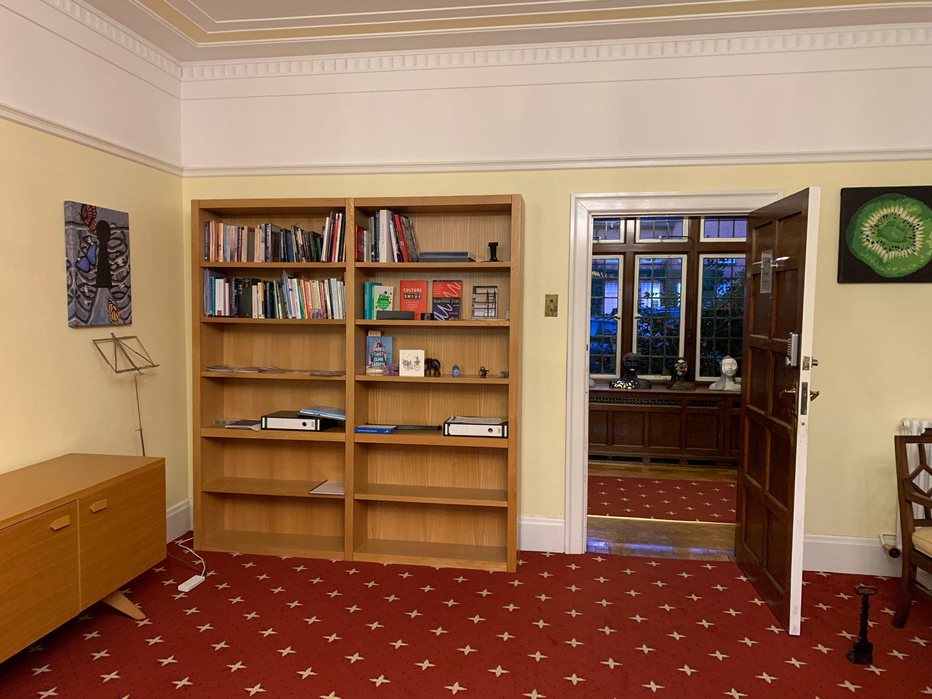
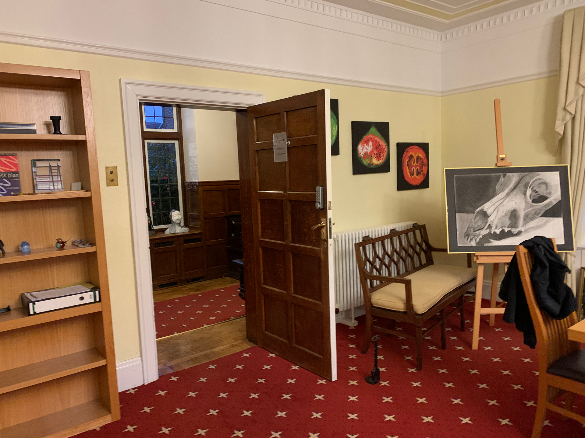
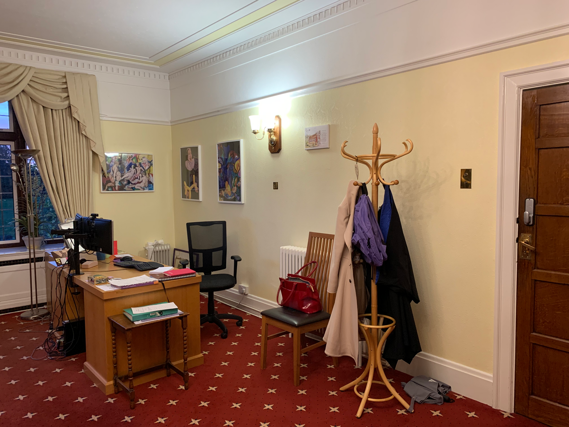
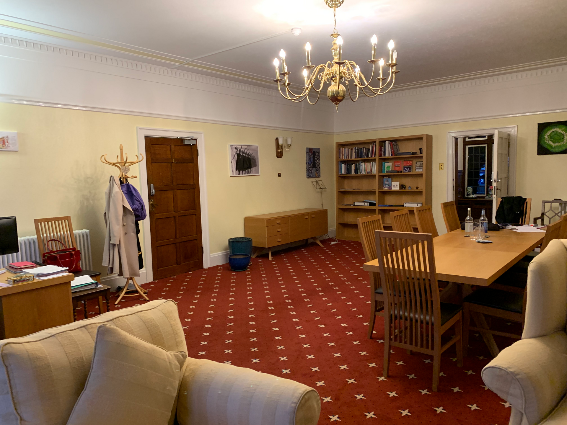
Before
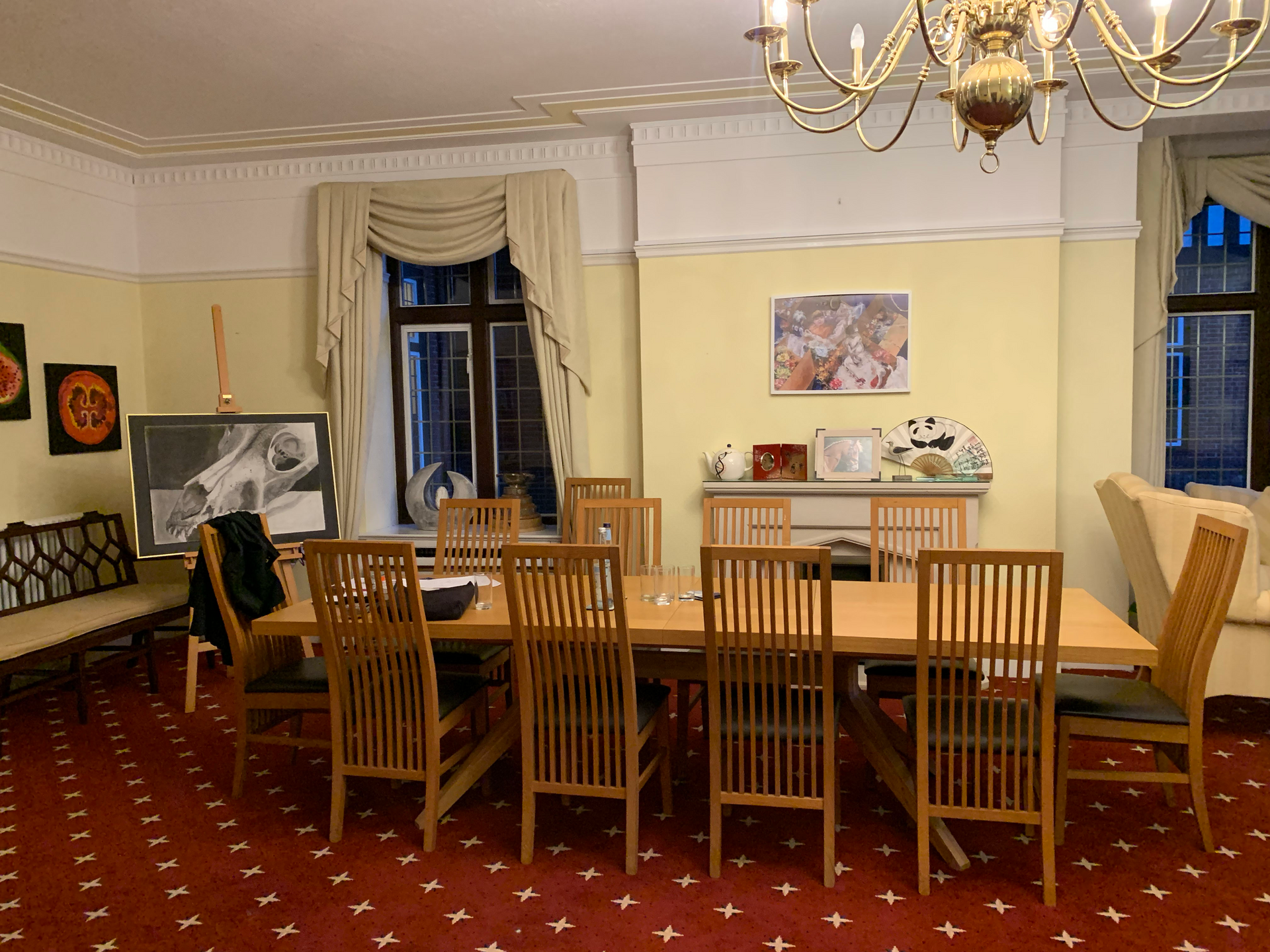
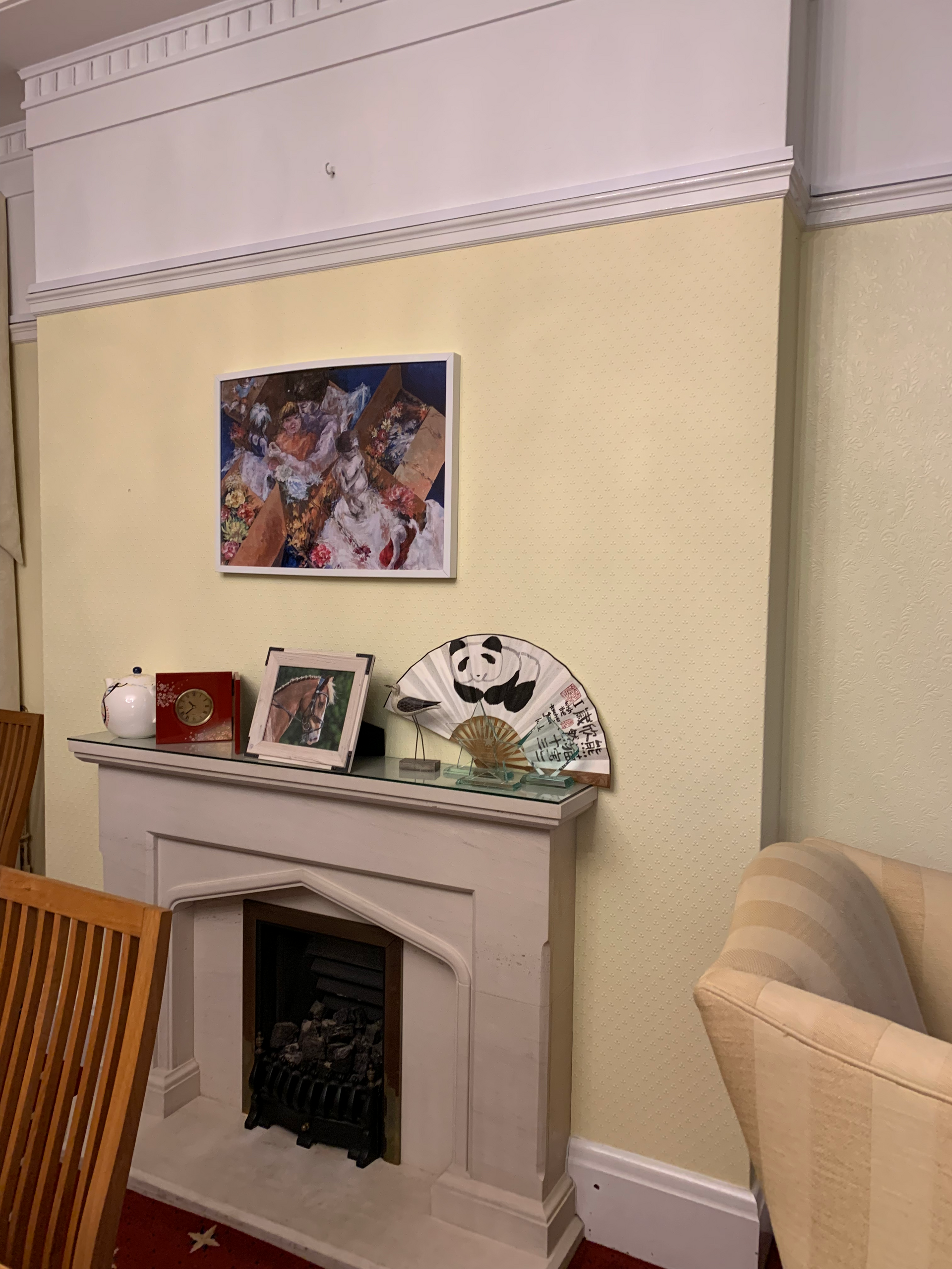
Below are some before pictures - a dated looking space, which hadn't been updated for years.
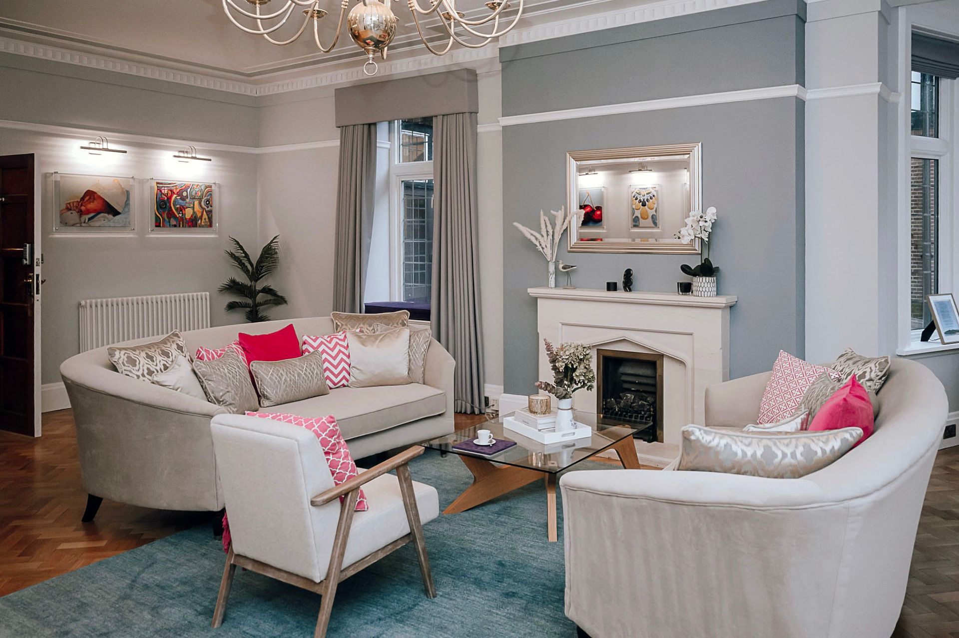
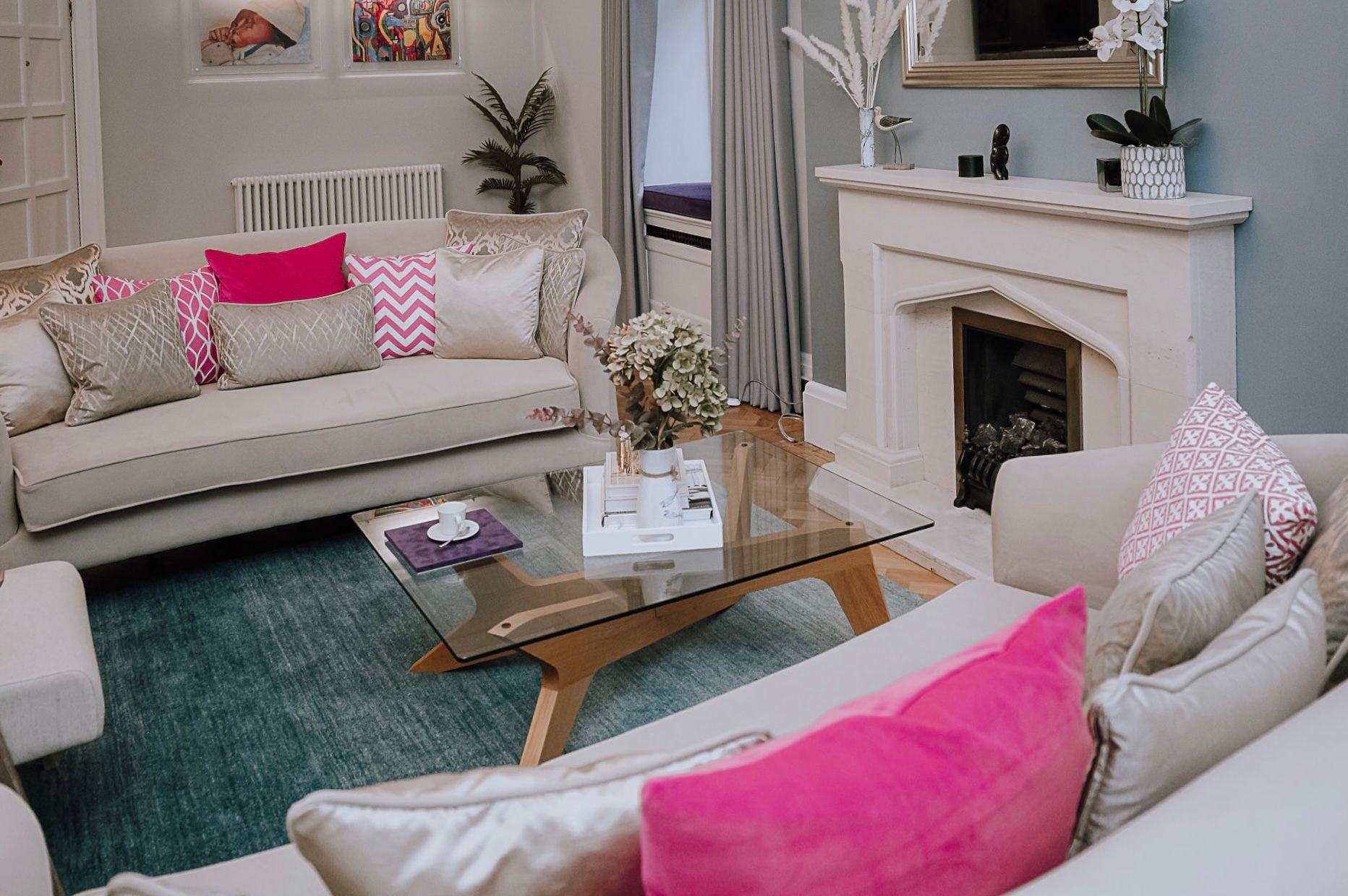
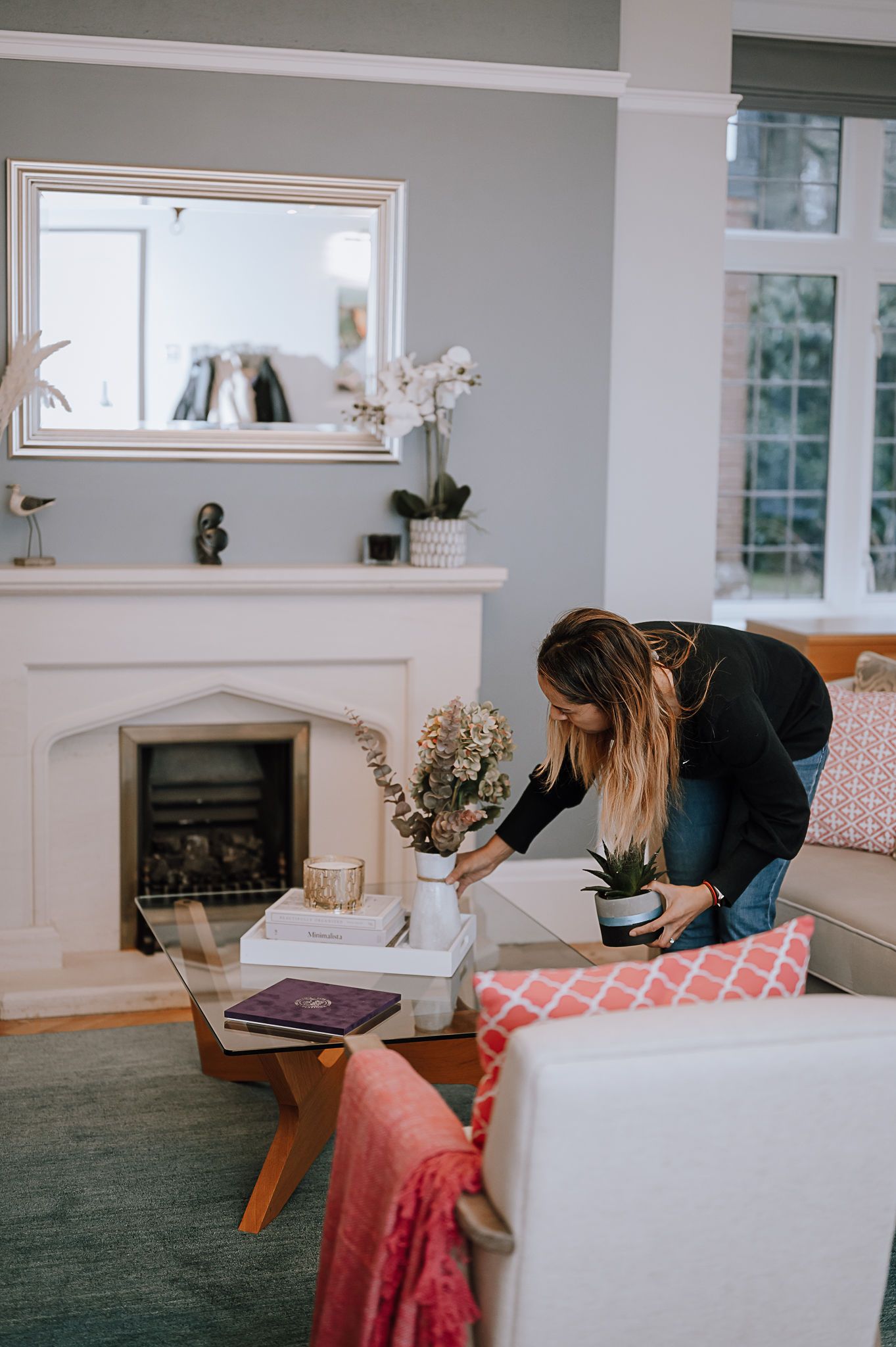
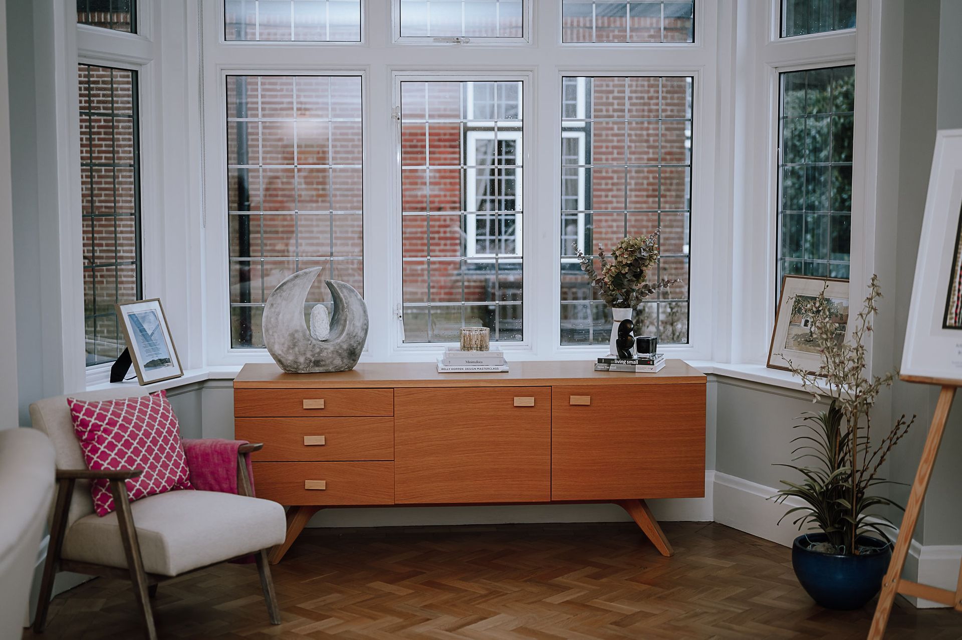
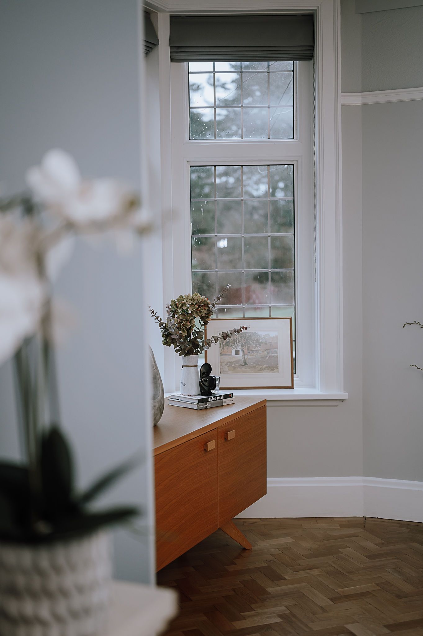
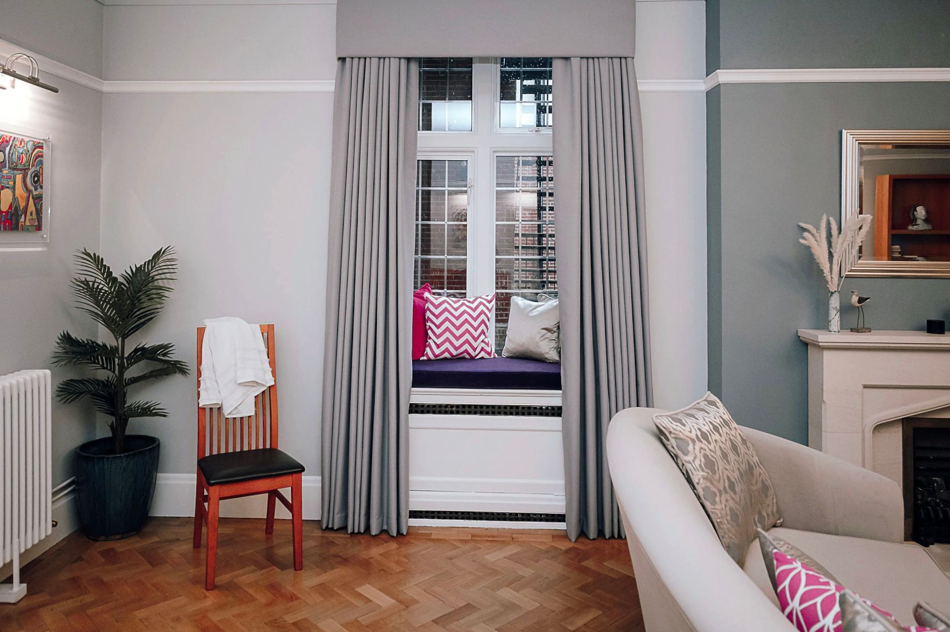
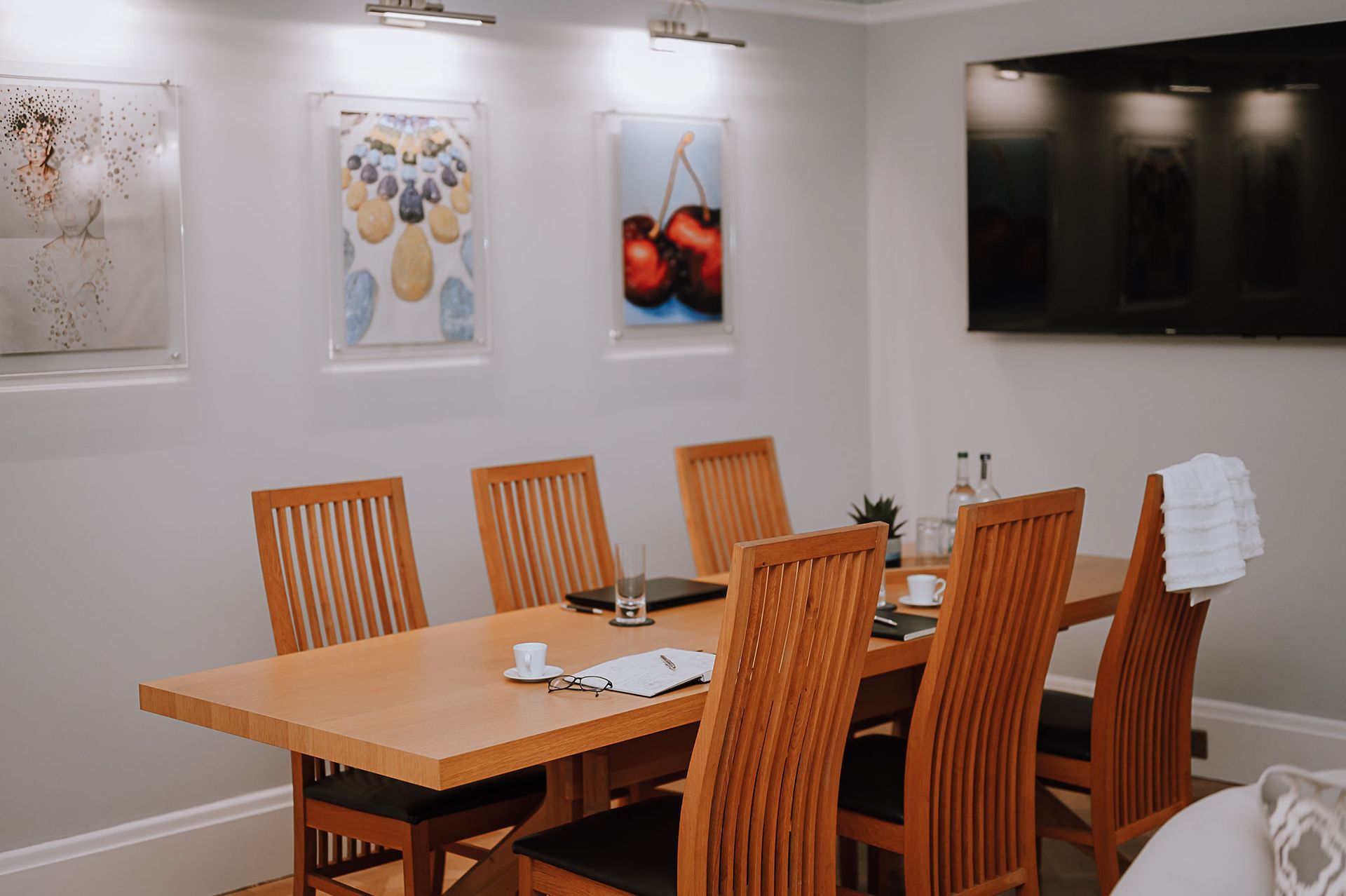
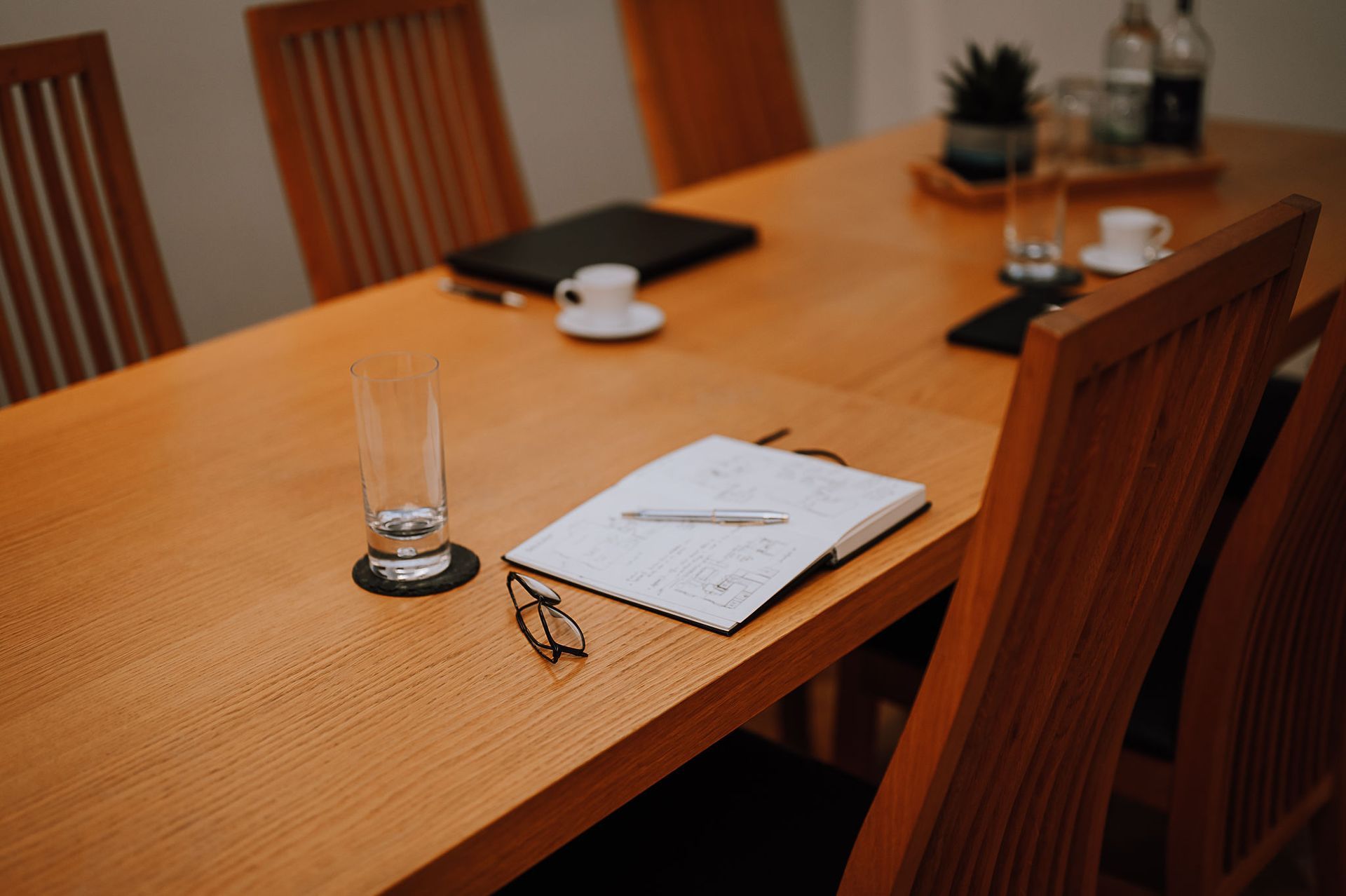
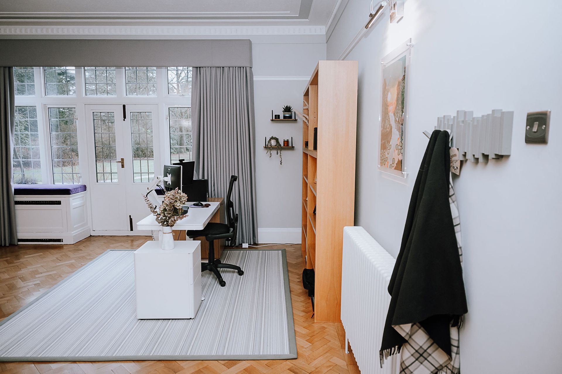
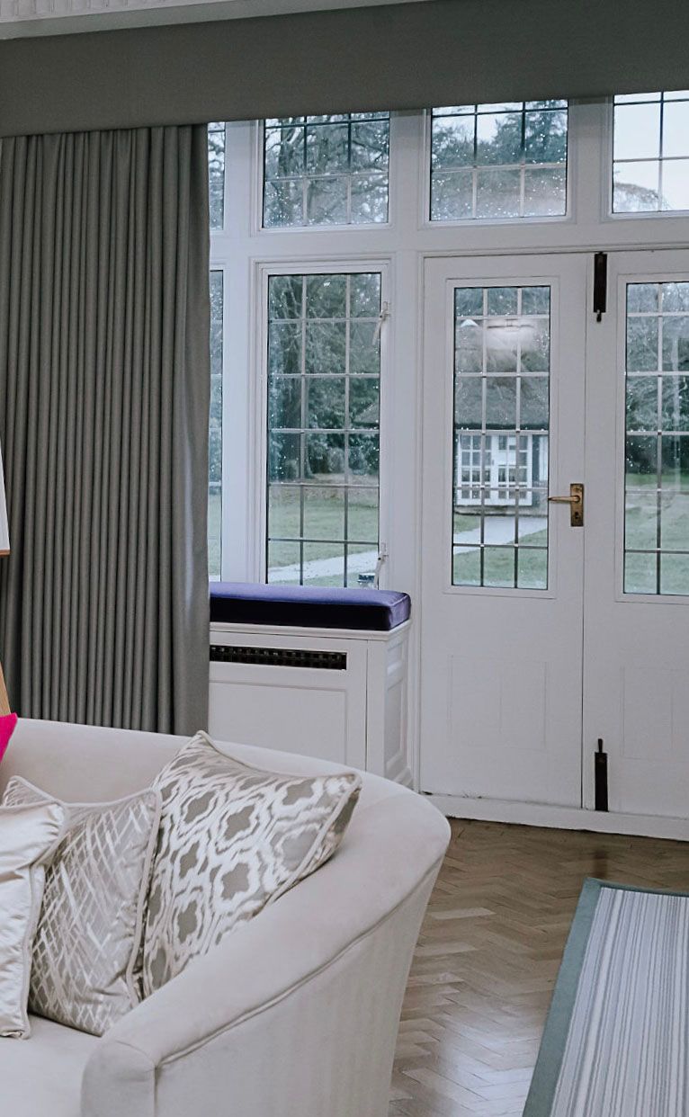
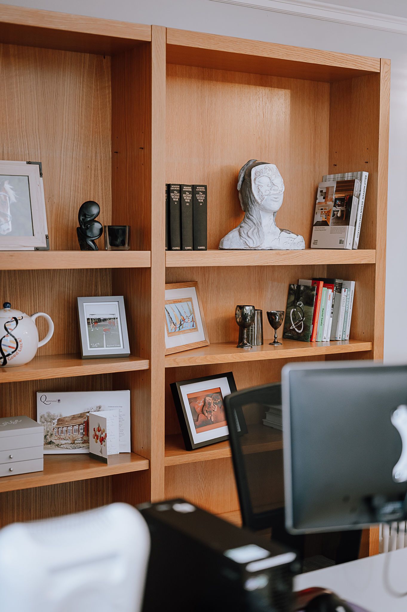
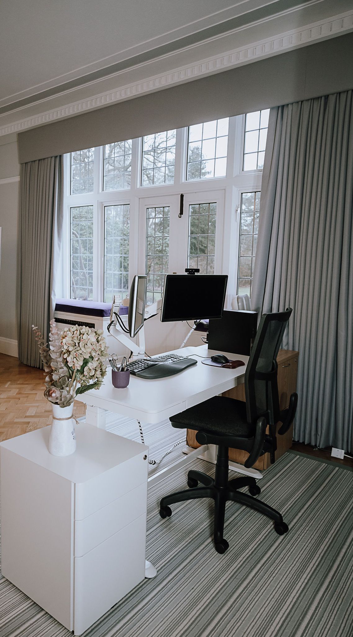
The existing layout was sub-optimal with a conference table placed in front of the fireplace, and the entertainment area placed far away from the French doors leading to the terrace where refreshments are served in the summer. So I first had to work on the layout of the room to create a modern, inviting, and flexible space for the School's Principal to be able to organise staff meetings, meet parents, host venues, and work. To do so, I re-instated the existing "hidden" fireplace into a feature and focal point by relocating the seating area in front of the fireplace, moving the console table in the bay window by the French doors, relocating the Principal's desk from one of the darkest part of the room (by the entrance door) to a bright space (by the French windows), and created zoning by adding a couple of large rugs under the desk area and seating space. I finally introduced several picture lights on the wall allowing my client to display the artwork produced by their pupils.
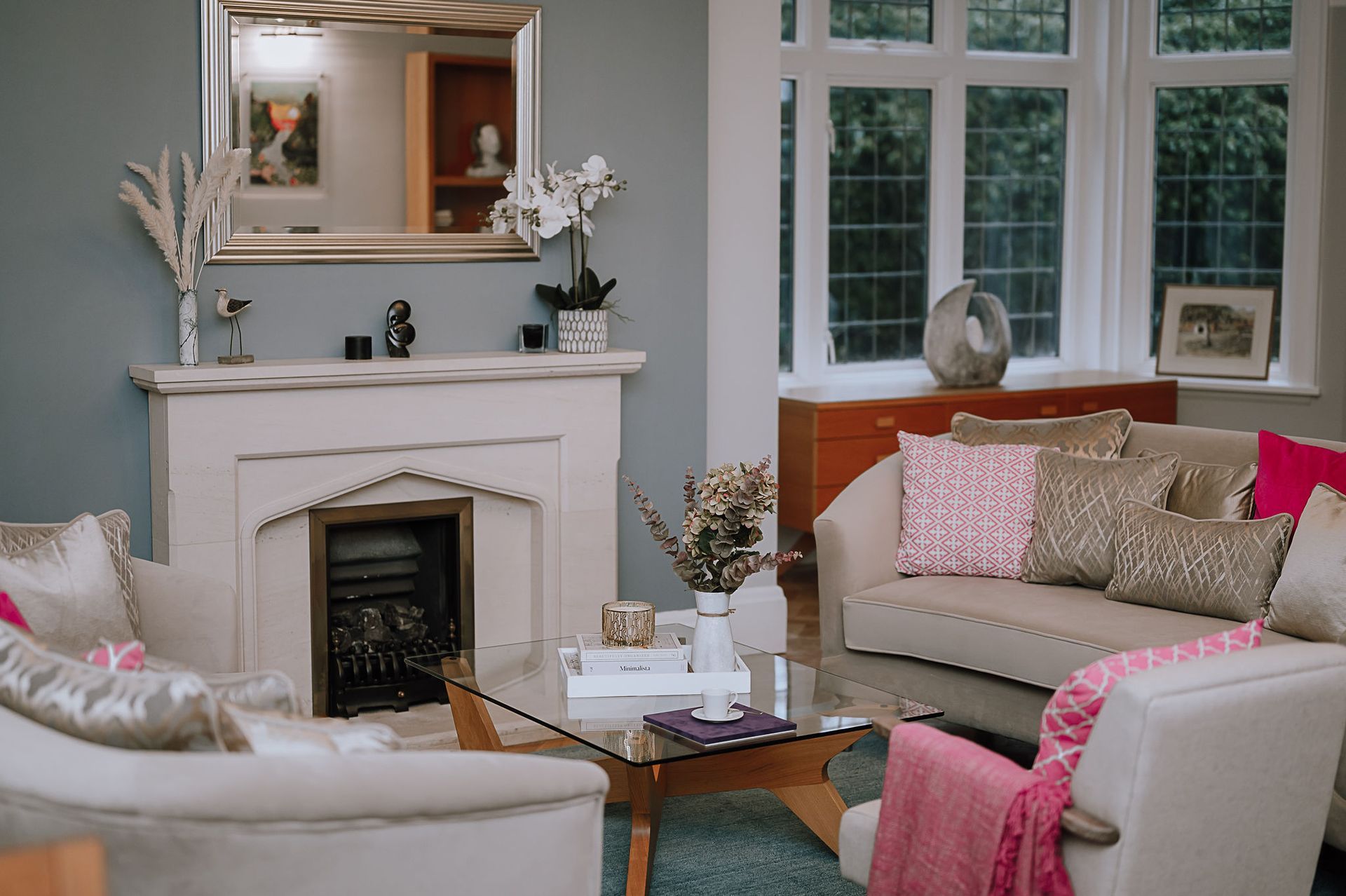
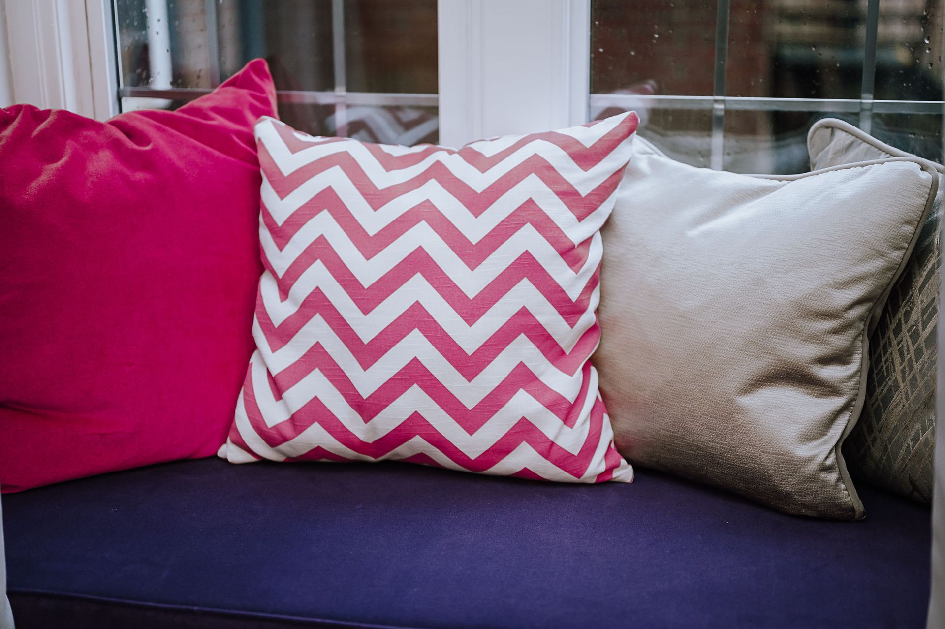
To finish it all off, I opted for a fresh and modern colour scheme, taking inspiration from the colours of the school. I used a light grey for the wall and a muted blue as accent colour for the fireplace. I finished the whole design by injecting some fun using some of the other, much bolder, school's colours - namely, hot pink and purple - into the room with soft furnishing (scatter cushions, throw, and window seat cushions).
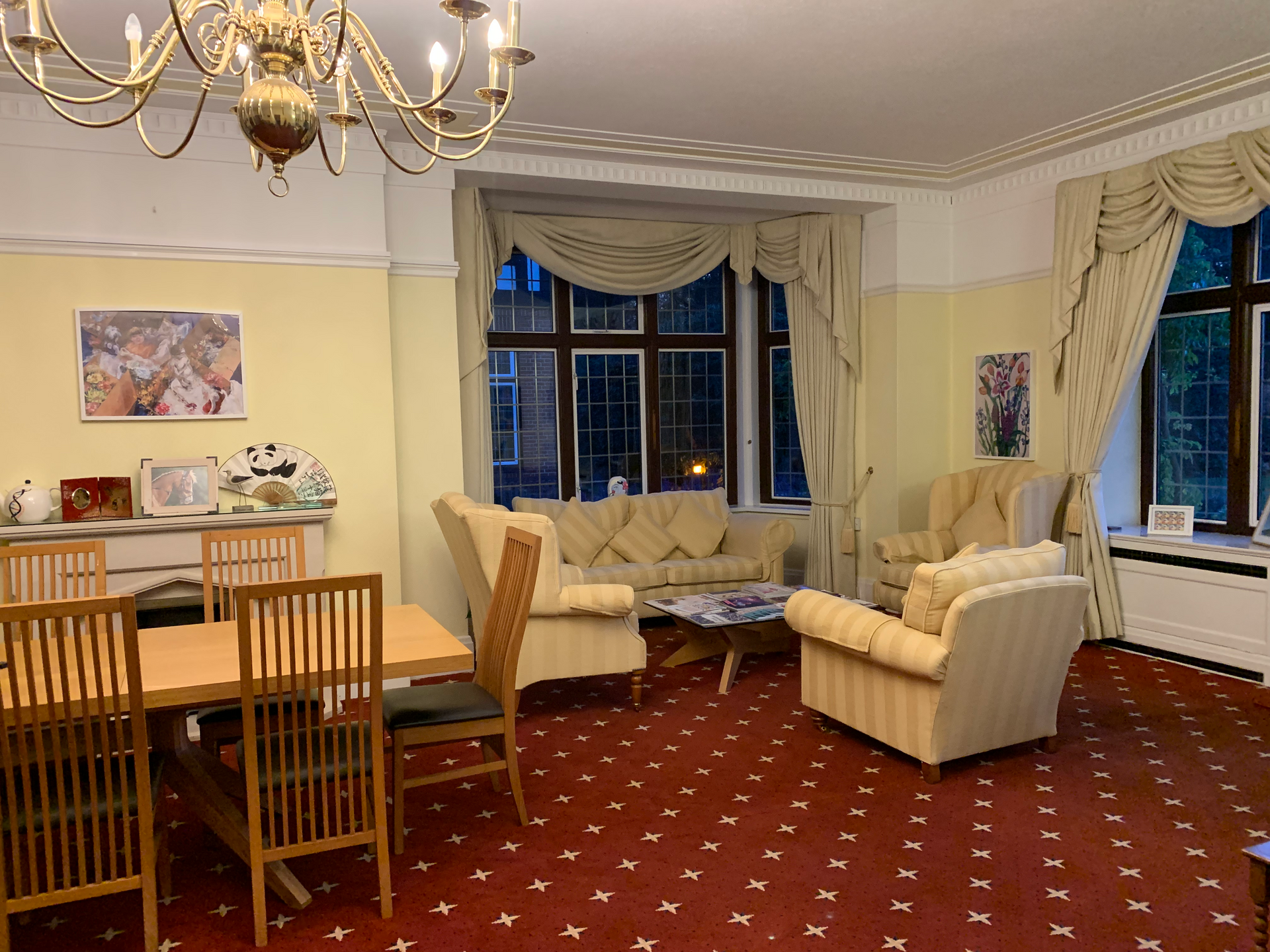
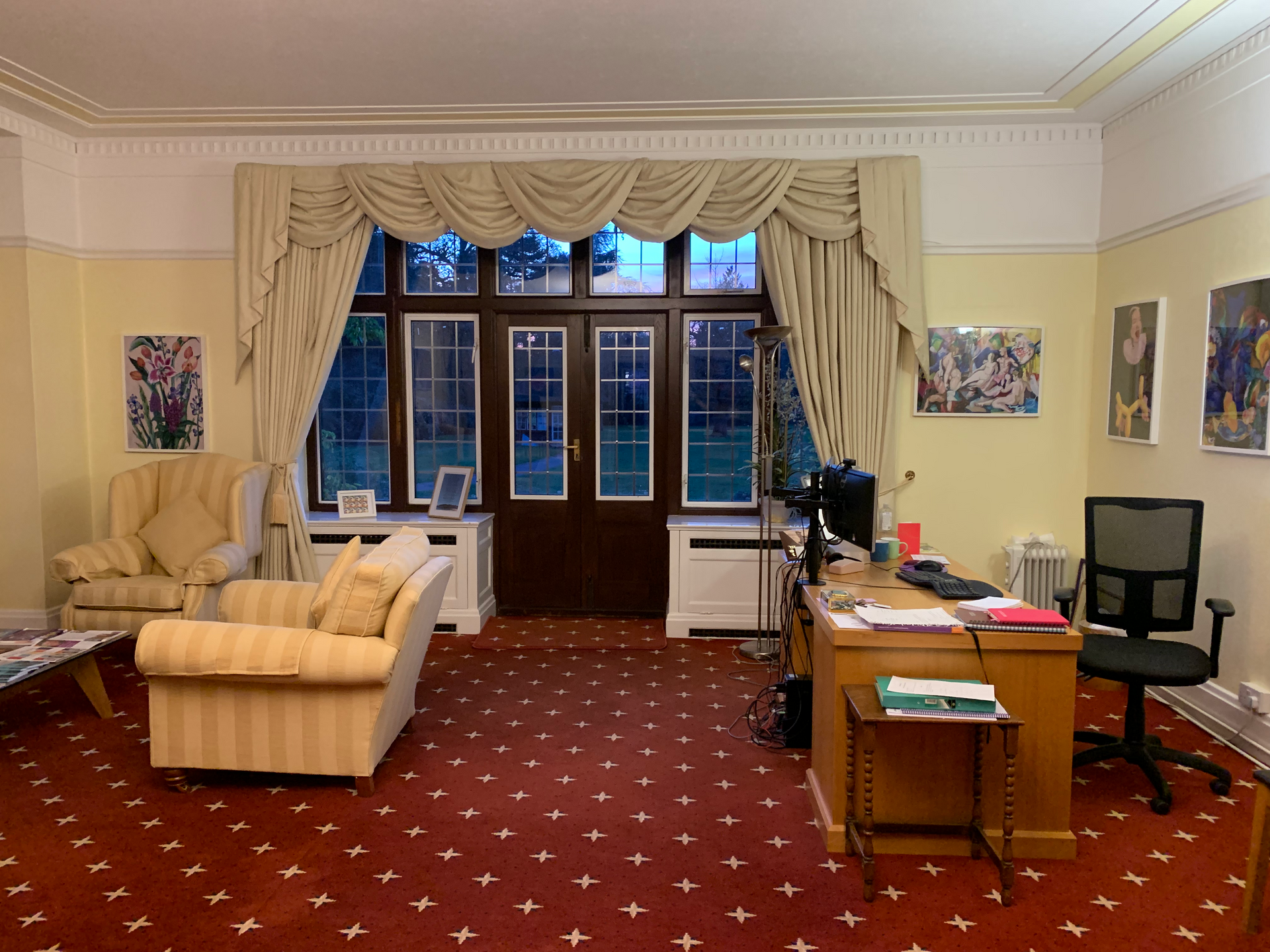
After...
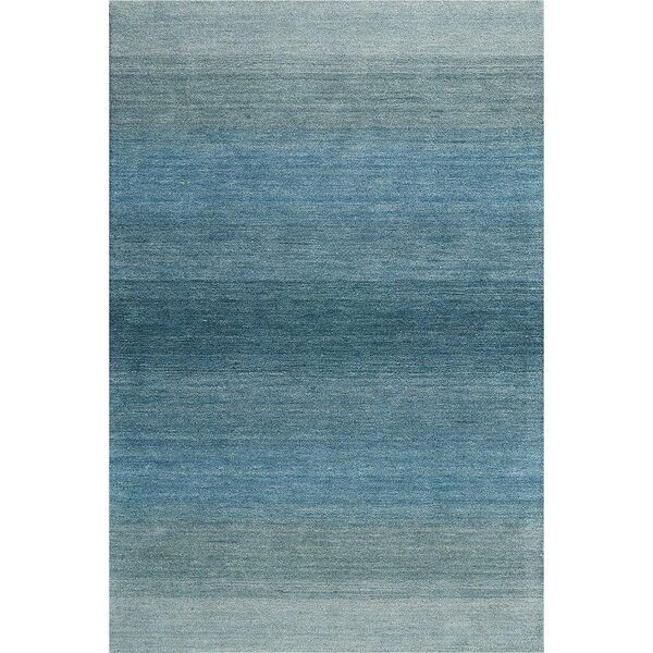
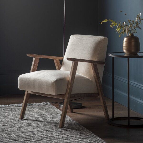
SHOP THE LOOK...
SHOP THE LOOK
Looking to re-create the same look at yours? We have compiled the list of items we sourced for this games room below.
Reach out if you would like to place an order and see whether you could benefit from some of our trade discounts!